05Supply Chain Management PlatformShipped
How do you refine a supply planning tool when the entire workflow was mapped to the wrong needs?
The existing inventory tool was not gaining traction. I led discovery that surfaced a systemic blocker, made the case for a full redesign, and drove the team through rapid design to ship a multi-screen system customers immediately adopted.
Role: Product Design LeadDuration: 2 quartersTeam: Product Manager, 2 Product Designers
Weekly Active Users
10x
Problem
Supply planners were not using the tool they paid for. Complaints and feature requests were piling up, and leadership asked us to review the feedback and make some small improvement recommendations.
The assumed fix
Before research, the problem seemed straightforward: give planners a better view of inventory at a given location, with clearer breakdowns for available, unavailable, and expiring stock. A few targeted improvements seemed like they might be enough.
Validating the Plan
I worked with the PM to set up user interviews to confirm our approach. I wrote the research strategy and scripts, facilitated sessions, and synthesized findings with the team. The results revealed we had a much bigger problem on our hands. The tool's core unit of analysis was one planners almost never used.
The actual need
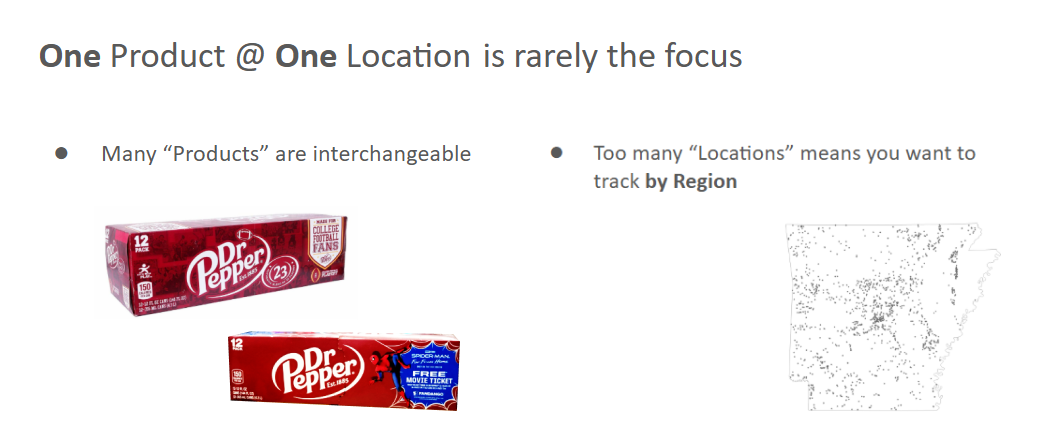
The tool was designed to show inventory information for one single product, at one single location. However, many products are interchangeable SKUs that can substitute for each other, so planners needed data by product category. And, with dozens of locations, planners needed to aggregate by region, not just view individual sites.
Advocating for a total overhaul
There was no way to patch the existing UI to serve these needs. I built a presentation showing the gap between the current product and how planners actually worked, and presented the recommendation to the CTO and the Director of Product. They agreed, on the condition it could be done fast enough to meet a contractual deadline. We had two weeks to start handing off requirements and early designs.
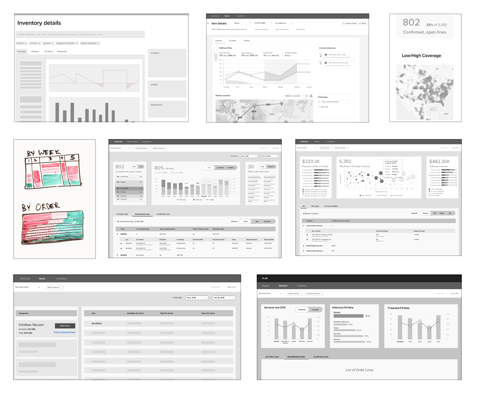
Rapid Sketching & Wireframing
I roughed out a high-level ideal scenario flow, then led two designers in a rapid, 2-day sketching sprint. We came up with several different concepts, then narrowed to the strongest direction.
New System Proposal
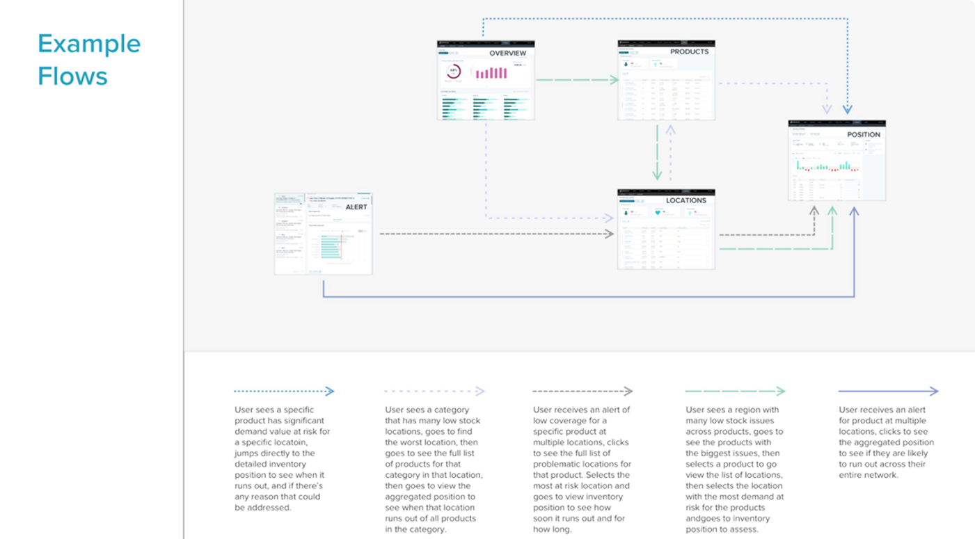
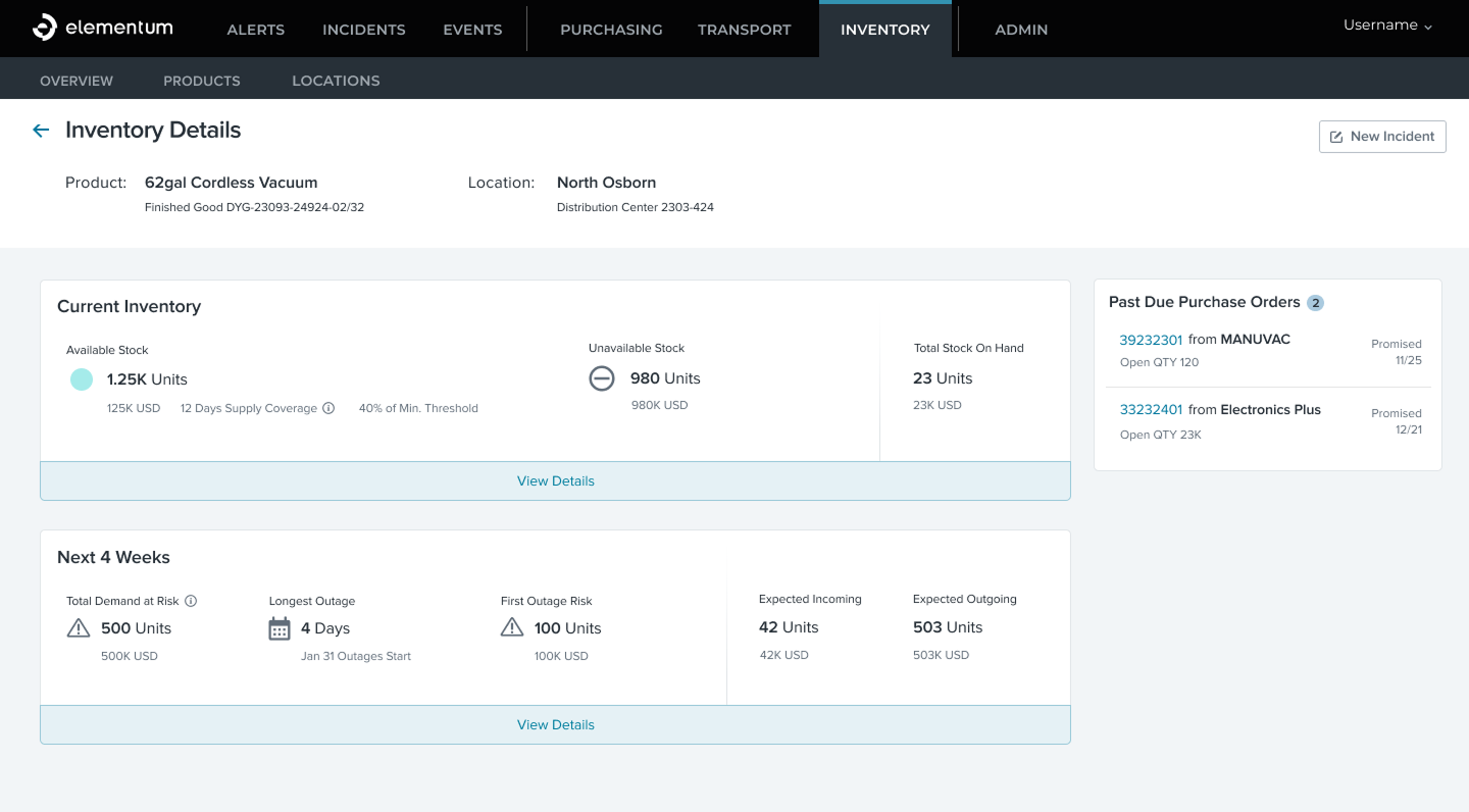
Partnering with one of the designers, I led the synthesis of concepts into a four-screen system: Overview, Products, Locations, and Inventory Position. Each screen could aggregate to provide the data planners needed. Some stakeholders were skeptical that so few screens could handle so many use cases; so I created a map of how all five workflows, kicked off by alerts, would be solved.
Designing for organizational variety
Different customers organized their businesses very differently, with distinct roles, hierarchies, and key metrics. One enterprise needed product IDs and unit counts at the warehouse level. Another needed product names and days-of-supply at the region level. We designed the system to surface type, ID, name, and all three stock-level units simultaneously, so both models worked without configuration.
Visual design
I sat side-by-side with our Senior Product Designer to apply the existing design system and develop new components.
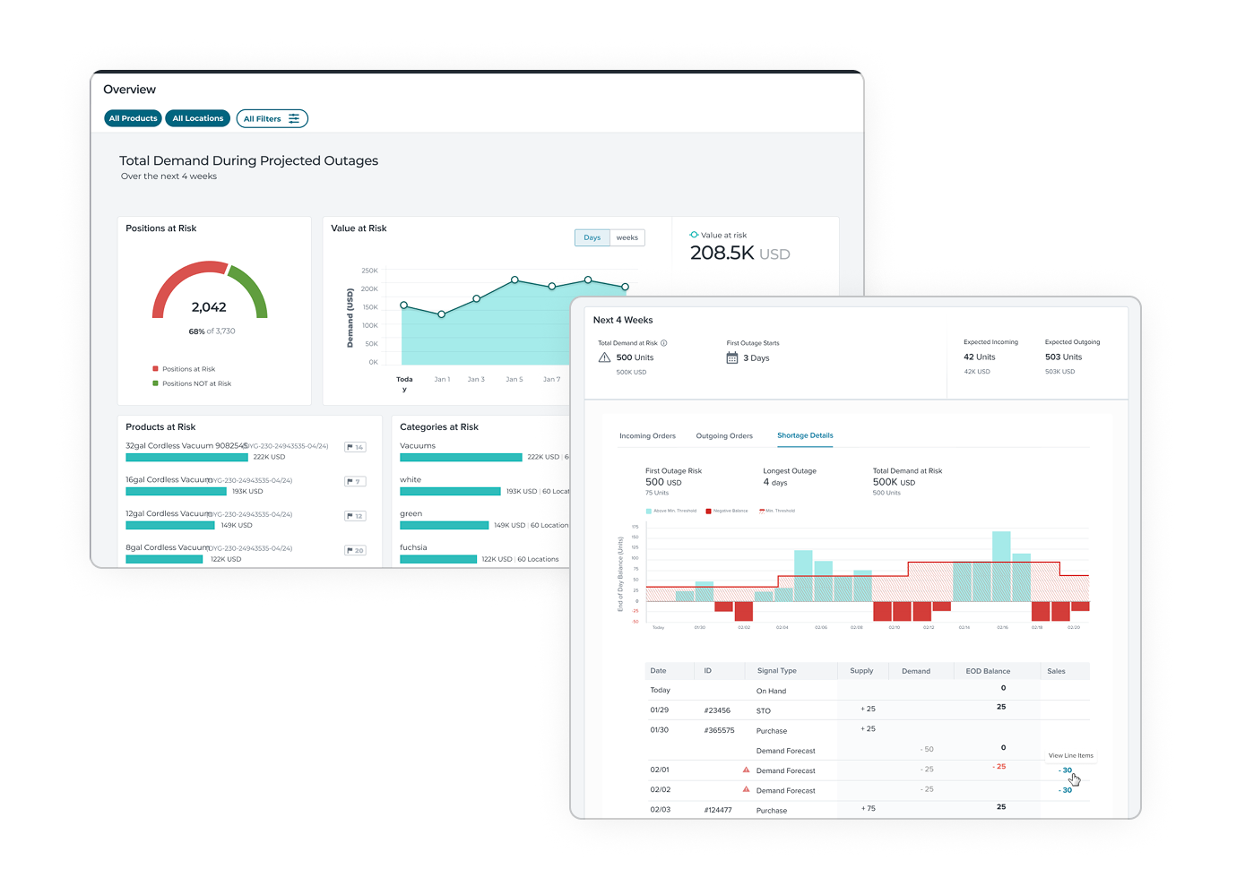
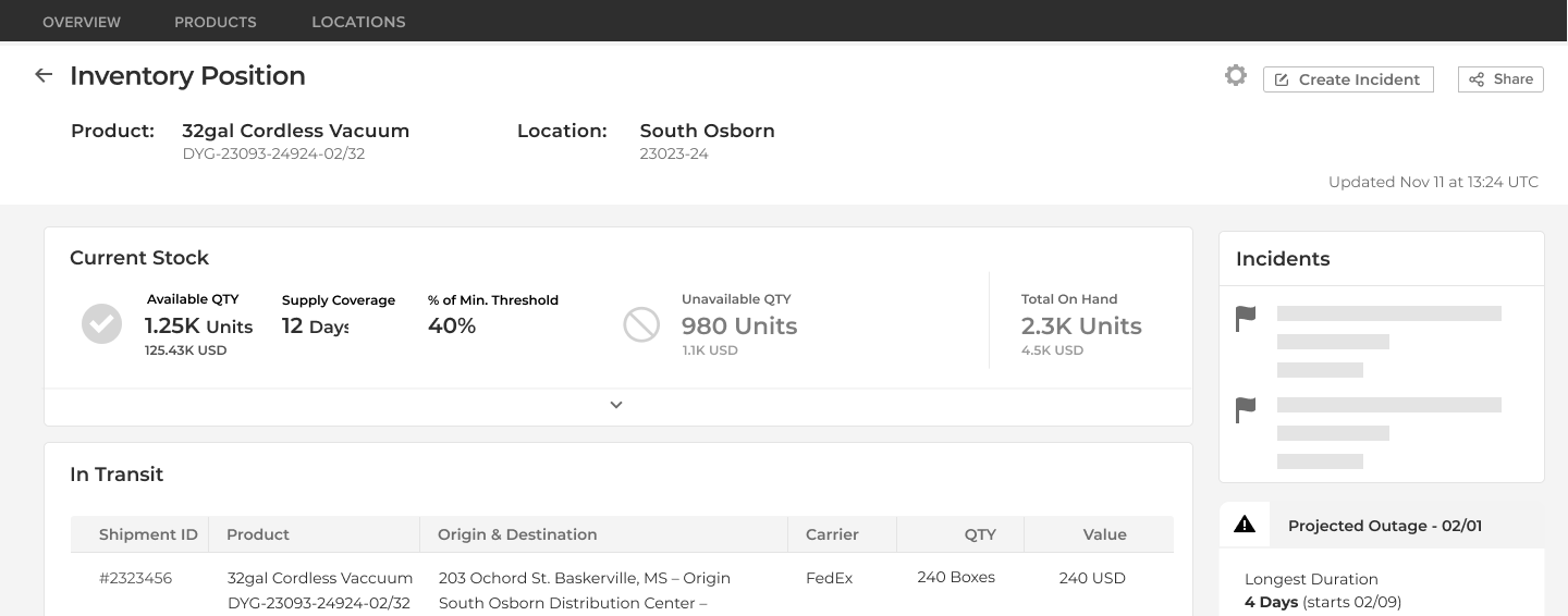
Two views, 24 data points
The Inventory Details screen organized current stock and near-term outlook into two expandable sections. Planners could get high-level insights at a glance or dig into the full detail when they needed it.
Finalizing the shortage outlook
At first, I was fairly confident that a line graph would be most intuitive for inventory projections, as shipments flowed in and out of locations throughout the day; we ran it by some users and found they thought in terms of 'End of Day balances,' so a bar chart worked much better for them.
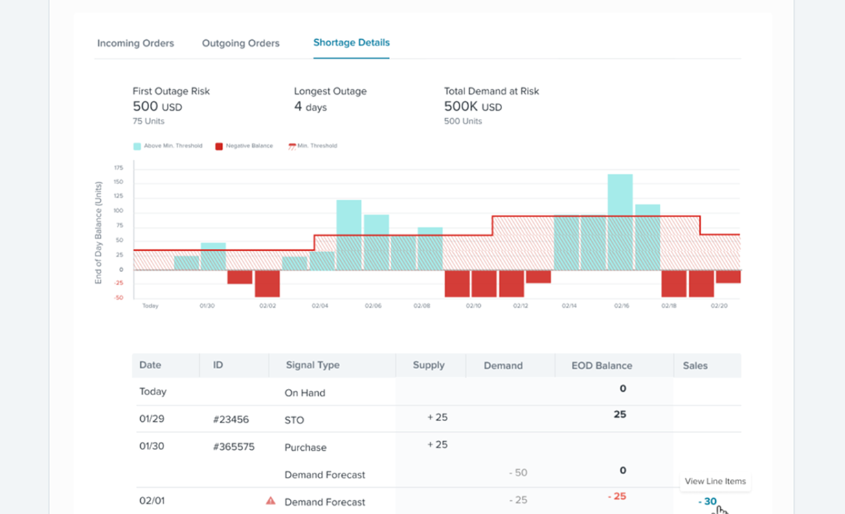
question we faced
Should future stock levels be visualized as a continuous line or discrete daily bars?
Options we considered
Continuous line chart
Familiar for trend data, but implies gradual change. Inventory moves in large steps, and a smooth line would obscure that.
Daily end-of-day bars
Matches how planners track performance: end-of-day balance is the key data point their processes and systems are built around.
What we chose and why
We chose daily bars representing end-of-day balance. Though inventory changes continuously, planners' processes and mental models revolve around end-of-day snapshots. Bars matched that operational reality.
What we learned
In operations tooling, visual metaphors need to match the user's real workflow, not general charting convention. The intuitive choice, a smooth line, would have obscured exactly the data planners care about.
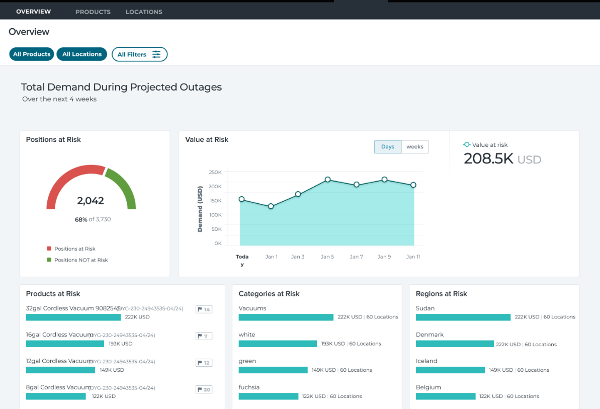
A new kind of dashboard for discovery
We were already calculating shortages and knew what orders were due when inventory would not be available, so I proposed a metric of 'Value at Risk' to prioritize where to focus. Users could browse global risks, or filter to certain countries, states, brands, product lines, etc. and see which Products, Categories, and Regions were putting the most sales in jeopardy.
What shipped
A four-screen inventory system supporting all five core planner workflows, that supported all the different enterprise processes. All users preferred the new system over the previous one. The new application saved major contract renewals and secured millions in annual revenue.
Outcomes
Increase in MAU
10x
Customer Response
Grateful
ARR secured
Millions
Shipped
On time
Reflection
- Leading discovery that fundamentally challenges an existing product takes conviction. Without a research-backed framing, the overhaul would have been impossible to sell.
- Having only two weeks to start handing off requirements forced a design discipline: sketching, reviewing, and iterating fast. I'd apply that pace even without the deadline.
- Earning leadership buy-in early made every downstream decision easier. Once the CTO and Director of Product agreed to the overhaul, the team had room to design with confidence.
Next case study
Private Investment Platform
Investment Contract Made Easy
0→1 subscription document experience; expert partners called it the best version they had ever seen.