06Private Investment PlatformShipped
How do you turn a 40-page complex contract into something anyone can complete?
Private fund subscriptions require a complex legal document filled with conditional regulatory language. I reorganized it from scratch, and collaborated with the team to design and deliver.
Role: Product DesignerDuration: 1 quarterTeam: PM, Product Designer, 2 Front-end Engineers
Advisor feedback
"Best contract ever"
Problem
Private fund subscriptions require completing a 40+ page legal document filled with conditional regulatory language, repeated questions, and dense legal references. The users were advisors in small practices managing the process for their clients with no prior experience completing such documents. The task was to turn it into something lightweight and clear.
The constraint
Every question in the original document exists for a legal reason. The challenge was not to simplify the contract itself, but to find a better structure beneath it: one that matched how users think rather than how regulators write.
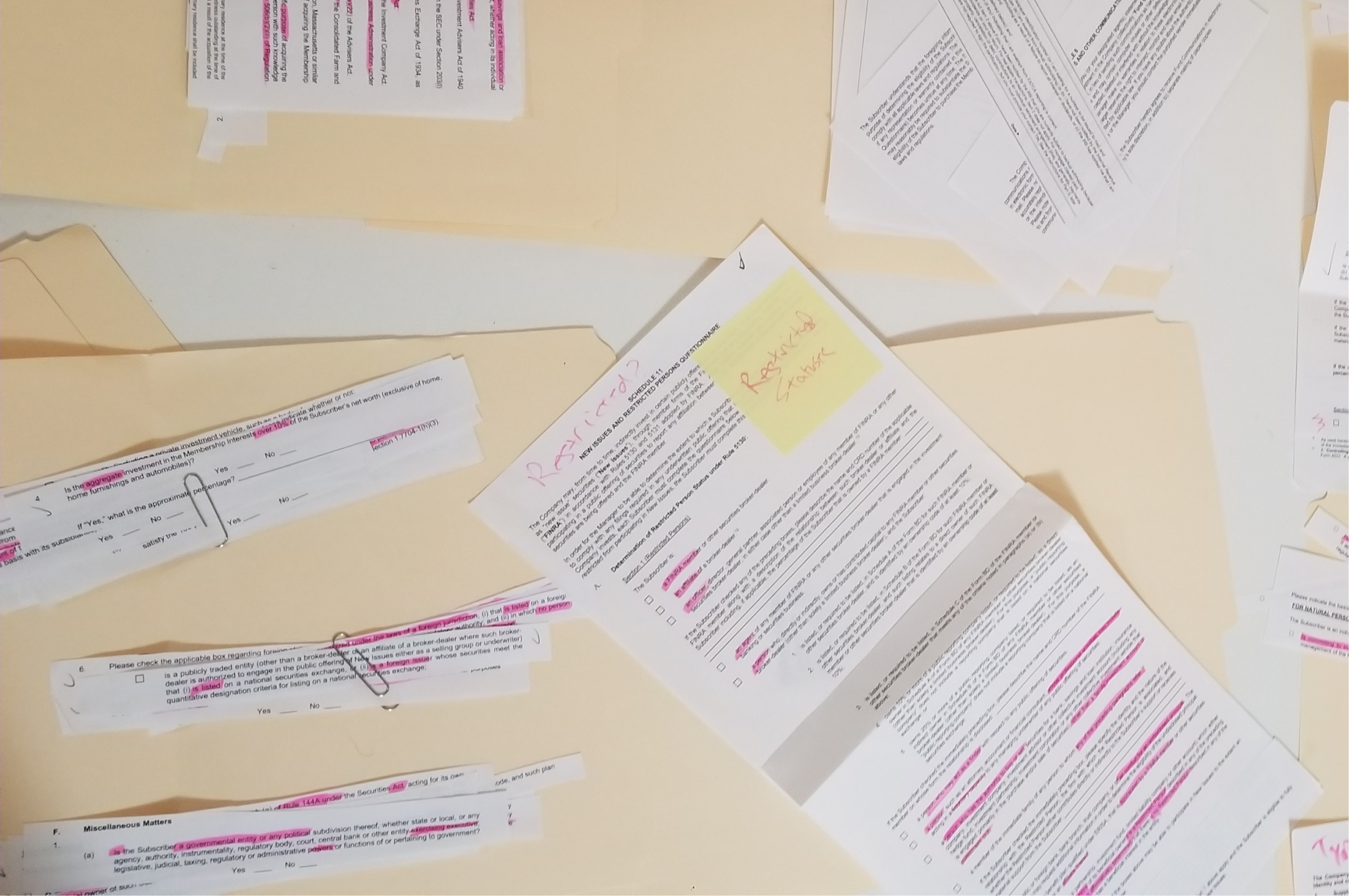
I started by printing the entire contract and physically cutting it apart. Every question became a separate slip of paper. I then used affinity diagramming to group related questions by topic, clipping them together and organizing them into folders by logical section.
Two things became clear immediately. First, the document's structure was driven by regulatory organization, not user logic; the same information was requested multiple times in different formats across different sections. Second, the investor's entity type (individual vs. business, trust, or IRA) determined roughly half the questions. An individual investor would never need to answer most of what the entity path required.
Physical analysis
Cutting the contract apart by hand made patterns visible that would have been easy to miss in a PDF. Redundant questions clustered together; topic groups emerged naturally. The physical process turned a 40-page problem into a manageable information architecture.
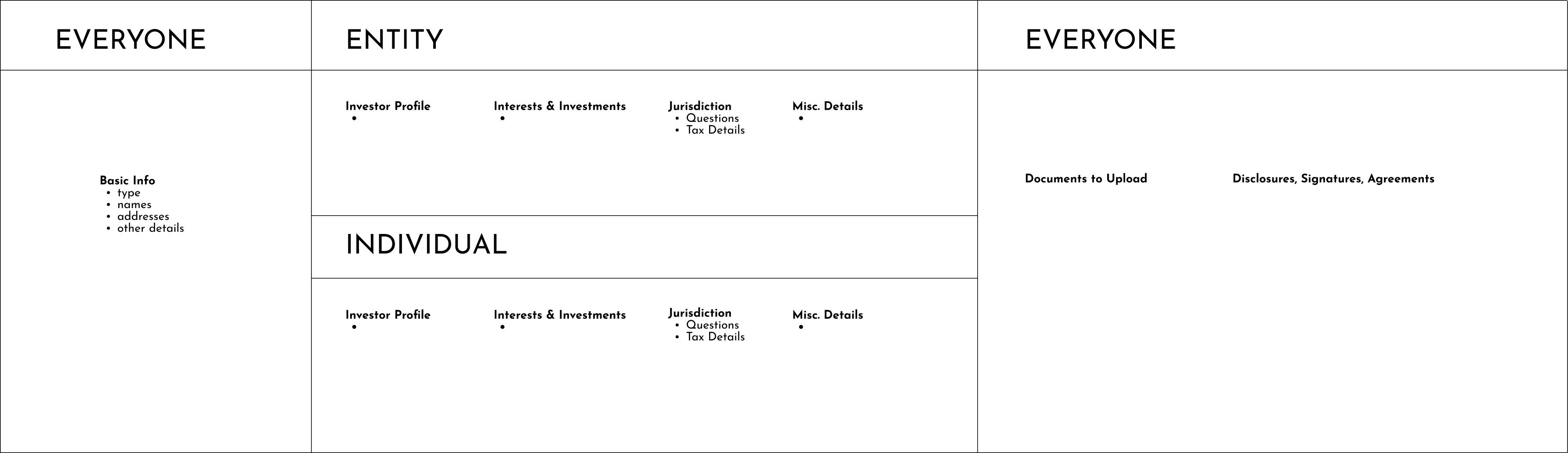
Two paths, one framework
Identifying entity type upfront let us eliminate roughly half the questions for individual investors before they had answered a single thing. Both paths shared the same section names and structure; only the content inside differed. This kept the experience consistent while dramatically reducing scope for the most common case.
Consolidating questions
The document asked for the same information multiple times in slightly different forms for legal reasons. Where possible, we consolidated these into a single question with smart conditional follow-ups: answer once, and the form only showed the next question if the answer made it relevant. This reduced the perceived length without removing any required information.
Conditional logic in practice
Each answer triggered only the follow-ups it warranted. A question that previously appeared three times in different sections became one question with two possible follow-ups, shown only when needed. The form felt responsive rather than exhaustive.
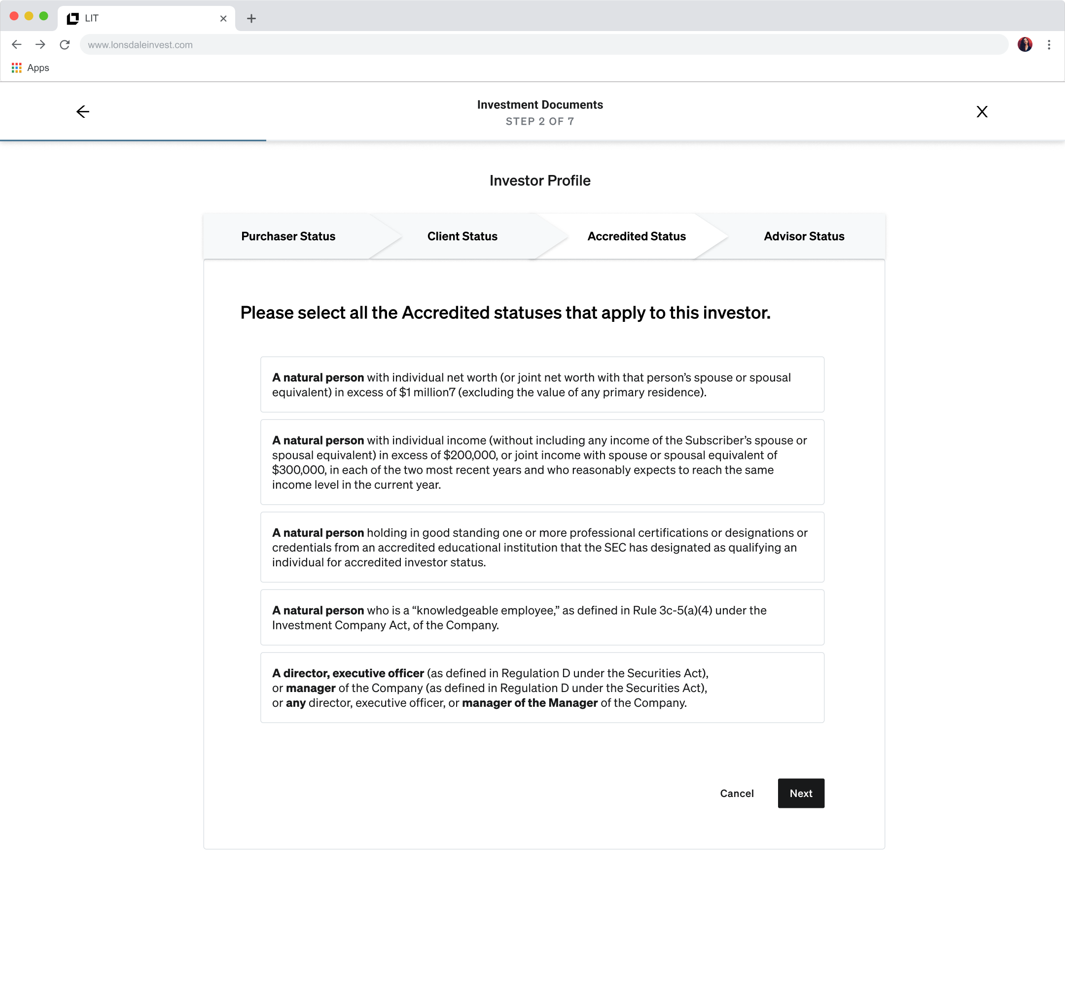
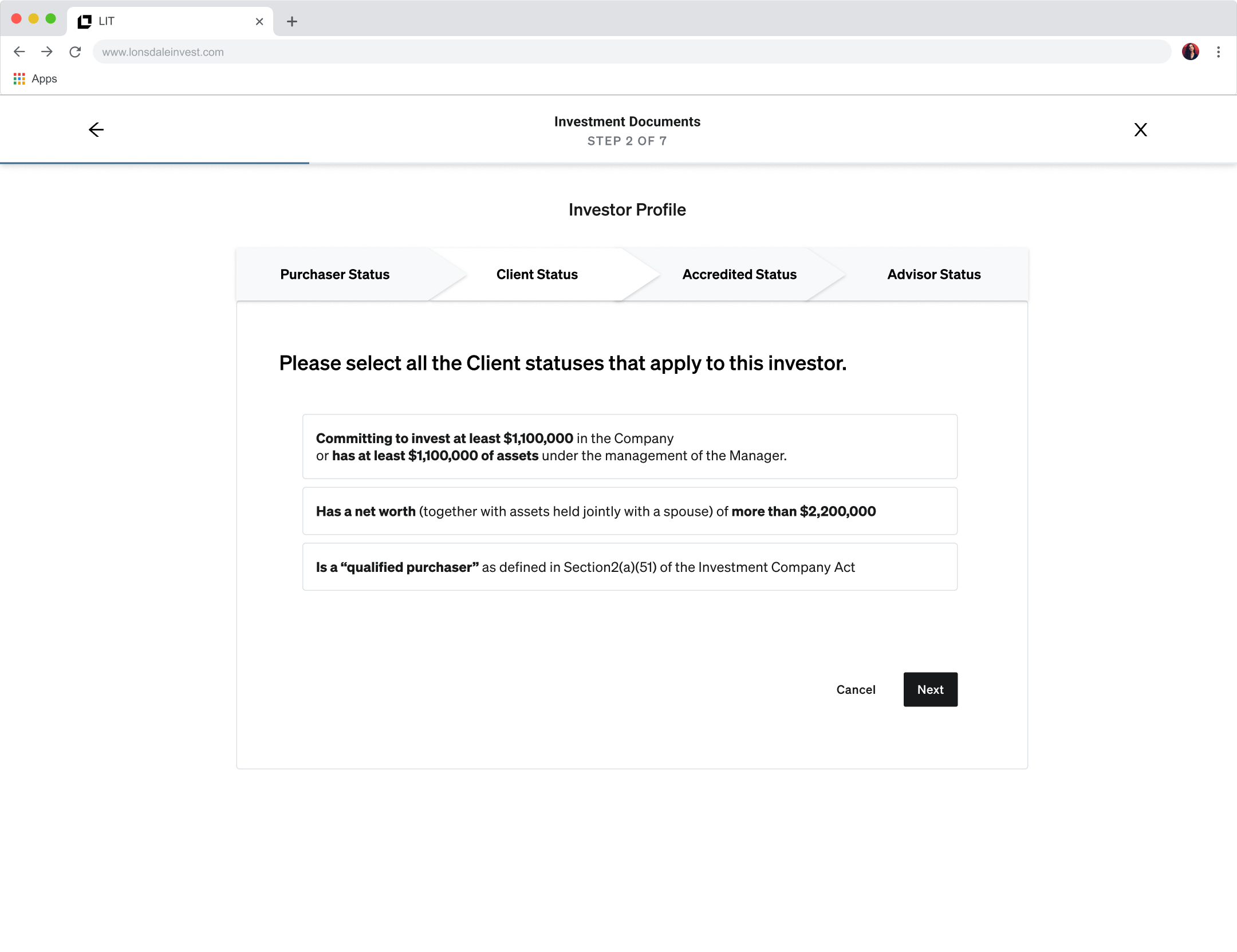
Organizing complex accreditation
Accreditation status was one of the most legally dense sections. Rather than presenting every option as a wall of text, we organized them into four distinct sub-steps with clear selectable cards. Dense regulatory language was preserved but given structure, making it scannable without obscuring what mattered legally.
question we faced
Should progress be shown as a persistent bar or an overview screen?
Options we considered
Persistent progress bar
Familiar pattern, but hard to render accurately across branching entity paths, and it offers no way to jump between sections.
Overview screen
Shows all sections at once, allows non-linear navigation, and was more feasible to build for the MVP timeline.
What we chose and why
An engineer suggested the overview screen, and we ran with it. Advisors could see the full scope upfront, jump to any section, and resume where they left off. It solved the progress and navigation problems in one move.
What we learned
Good ideas come from anywhere. The engineer's suggestion resolved a design problem I had been circling, and produced a better result than a progress bar would have.
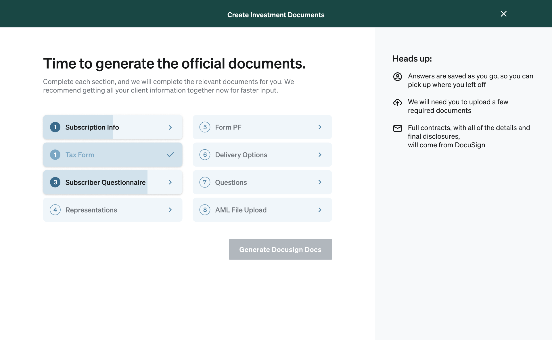
The overview screen
The final overview showed all eight sections with numbered status indicators, a two-column layout for quick scanning, and a persistent heads-up panel explaining what to expect. Advisors could start anywhere and return to any section. When all sections were complete, the Generate DocuSign Docs button became active.
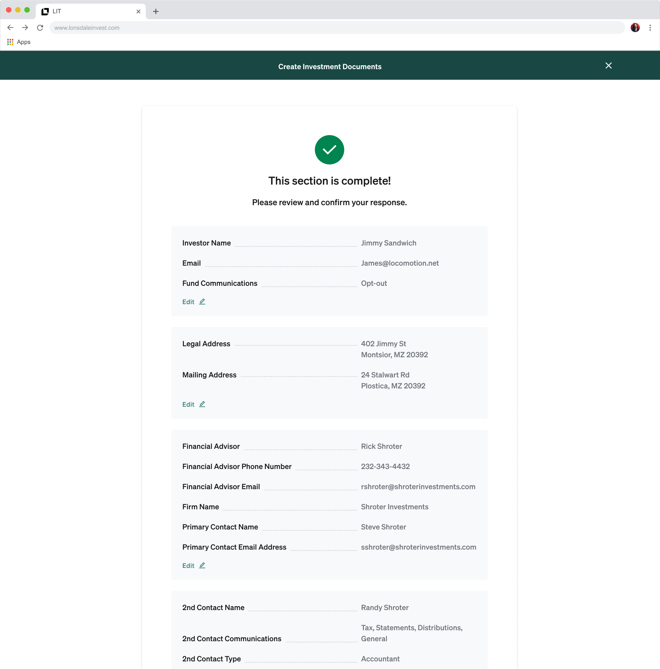
Section review
At the end of each section, advisors saw a full summary of their answers with inline edit links before moving on. This gave them confidence in their input and made corrections easy, without requiring them to navigate back through the questions.
What shipped
A complete 0→1 subscription document experience that enabled the company's first live investment transactions with minimal manual work. Expert partners well-versed in competitors gave unsolicited feedback: 'This is by far the best version of this I've ever seen.' The product positioned the company as the technology-forward option in a space where competitors were still sending PDFs.
Outcomes
Advisor feedback
"Best ever"
Async transactions
Enabled
Company perception
UX-Forward
Partner reaction
Celebration
Reflection
- Taking the contract apart and sorting questions was the right approach. Strictly digitizing the standard flow would have made it painful.
- Identifying entity type upfront was the single highest-leverage decision in the project; it eliminated roughly half the questions.
- Collaborating with engineers during scoping, not just at handoff, led to the overview screen approach and a stronger product.
Next case study
Enterprise AI Answers Platform
AI Source Cleanup for Enterprise
Discovery, concept exploration, and launch, for a semantic grouping MVP that drove organic adoption and unsolicited customer praise.