
Enticing Advisors Into Conversion with a Flexible System of Intuitive UI
Our business was selling access to exclusive private funds. We were targeting Advisors that were curious to learn how these could benefit their clients.
We were building a Beta product, and this was the top of the funnel.
We had to explain that different categories of private funds were valuable for different reasons, in different contexts.
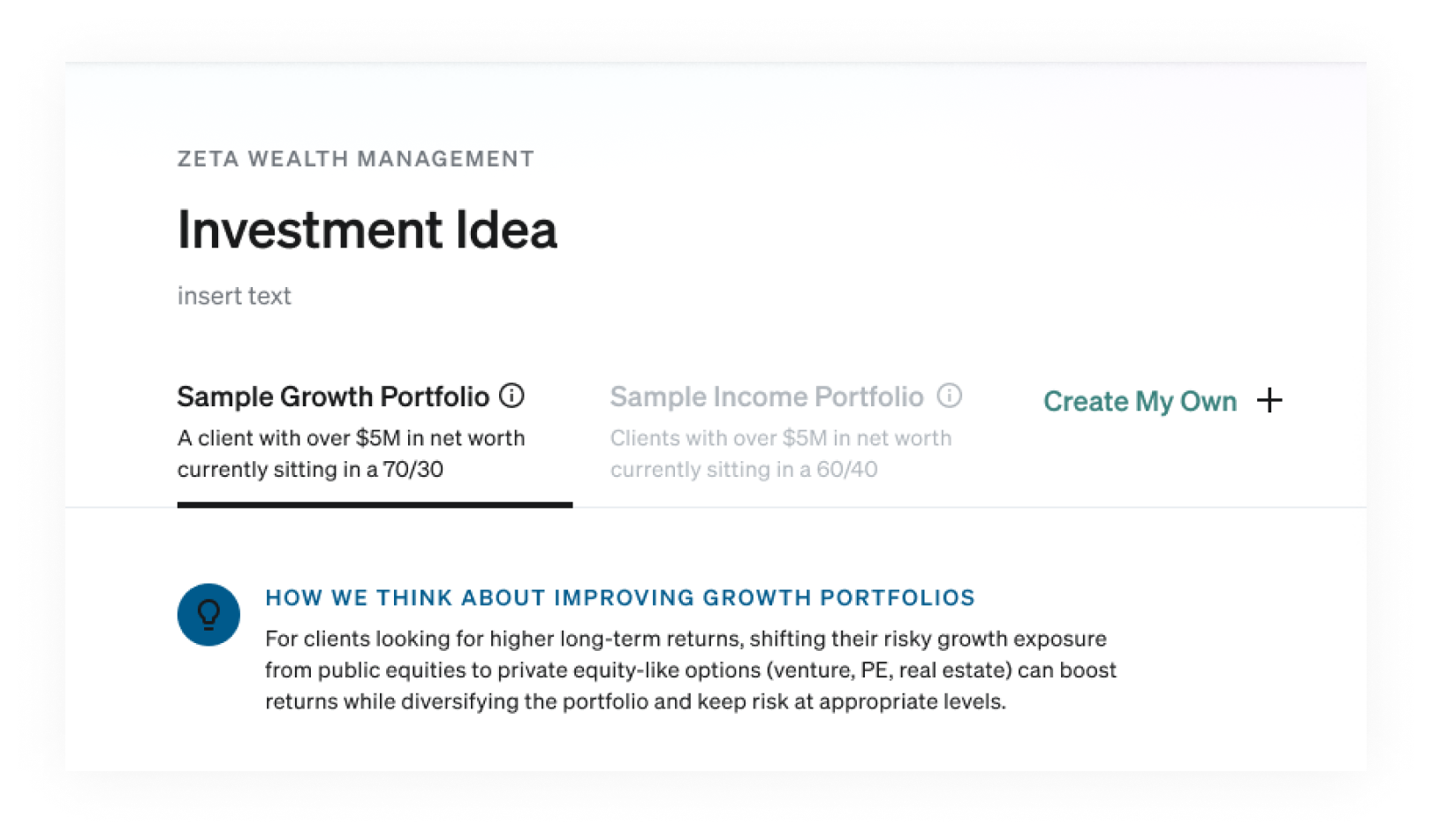
This was the rough wireframe which won in a broad concept-test with users.
I started iterating on the rough wireframe, exploring divergent concepts.
Having this much information in an in-page tab, felt heavy and complicated to me, I explored other areas on the page this information could live.
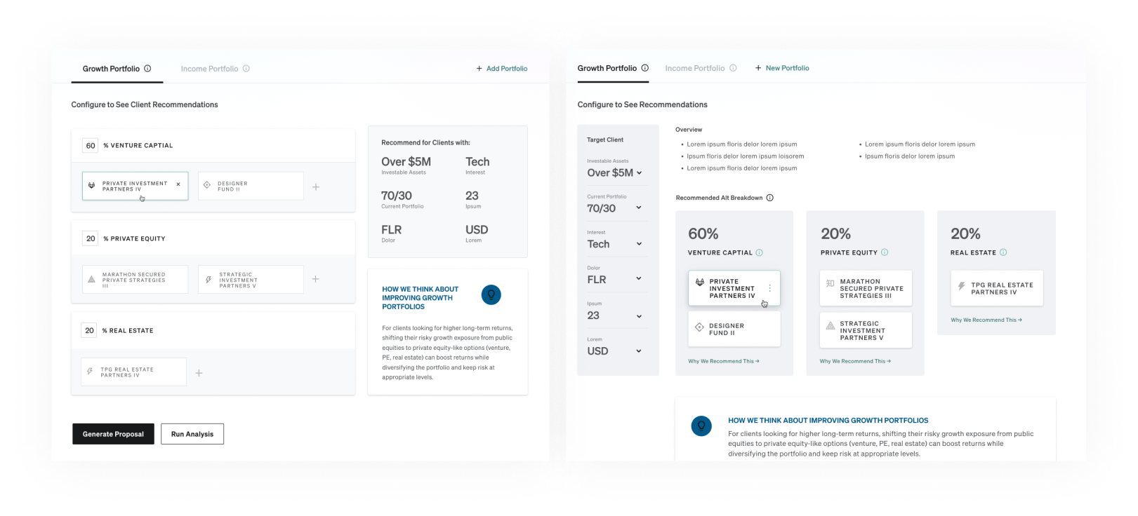
I came up with a few directions that seemed reasonable, but none were telegraphing the key information as quickly as I wanted.
I decided that the tabs were not working.
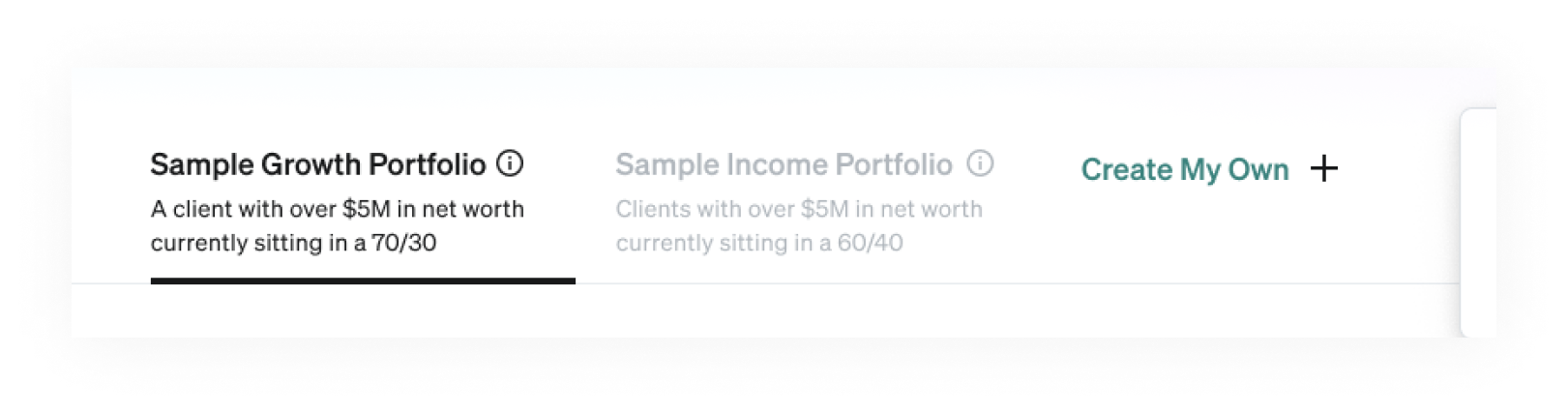
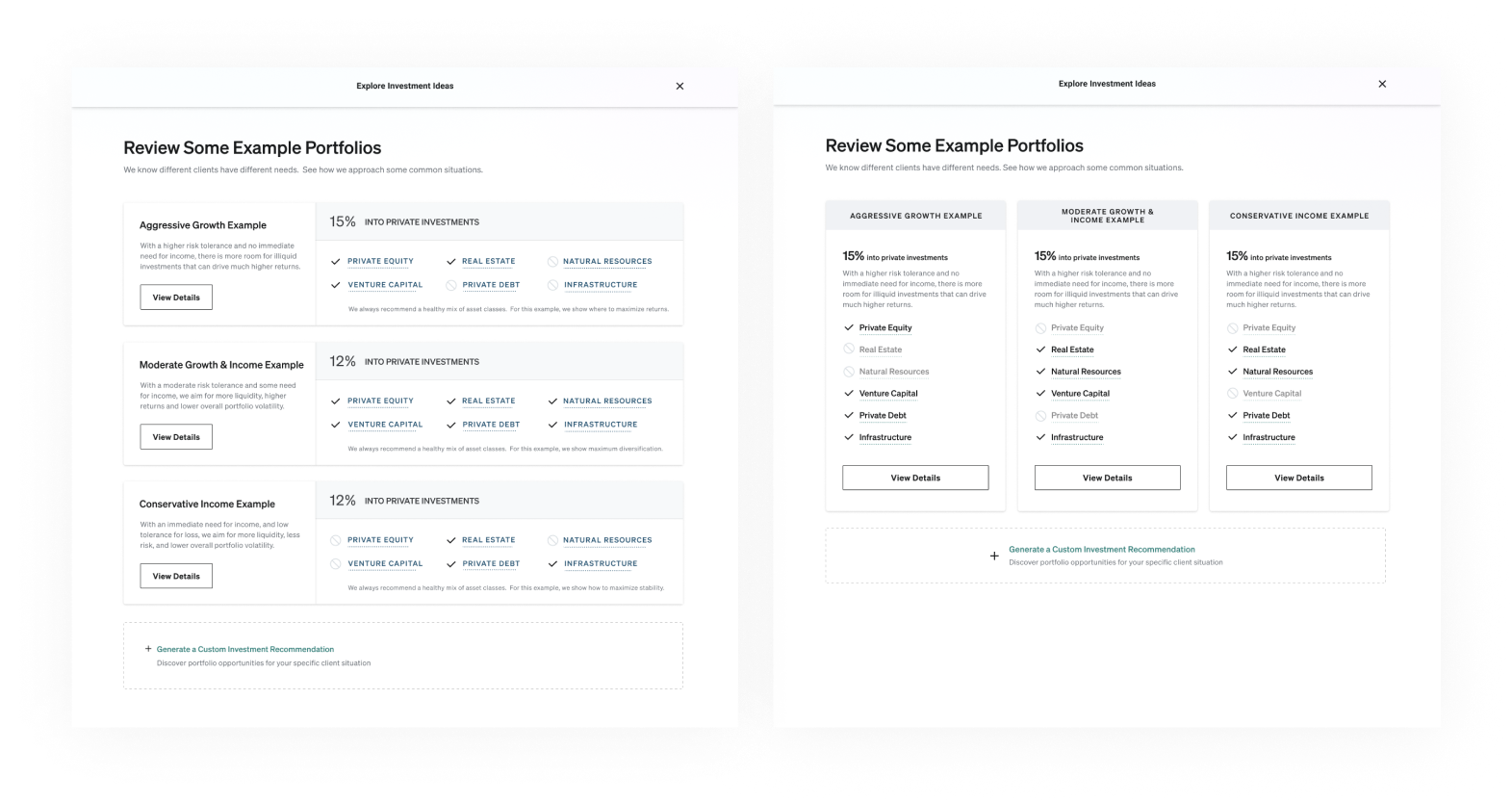
We needed a way for users to compare the different example portfolios, to inform which one they dug into.
I proposed splitting that one screen into two: 1. Pick a Portfolio Type 2. Review Details.
The first screen gave users a place to imagine a particular client, and start to intuit the difference between approaches to private fund investment.
The second gave them an opportunity to focus on the expected impact, and the specific funds involved.
Both areas were teaching advisors something new, but in a way they could instantly grok, and enjoyed working with.
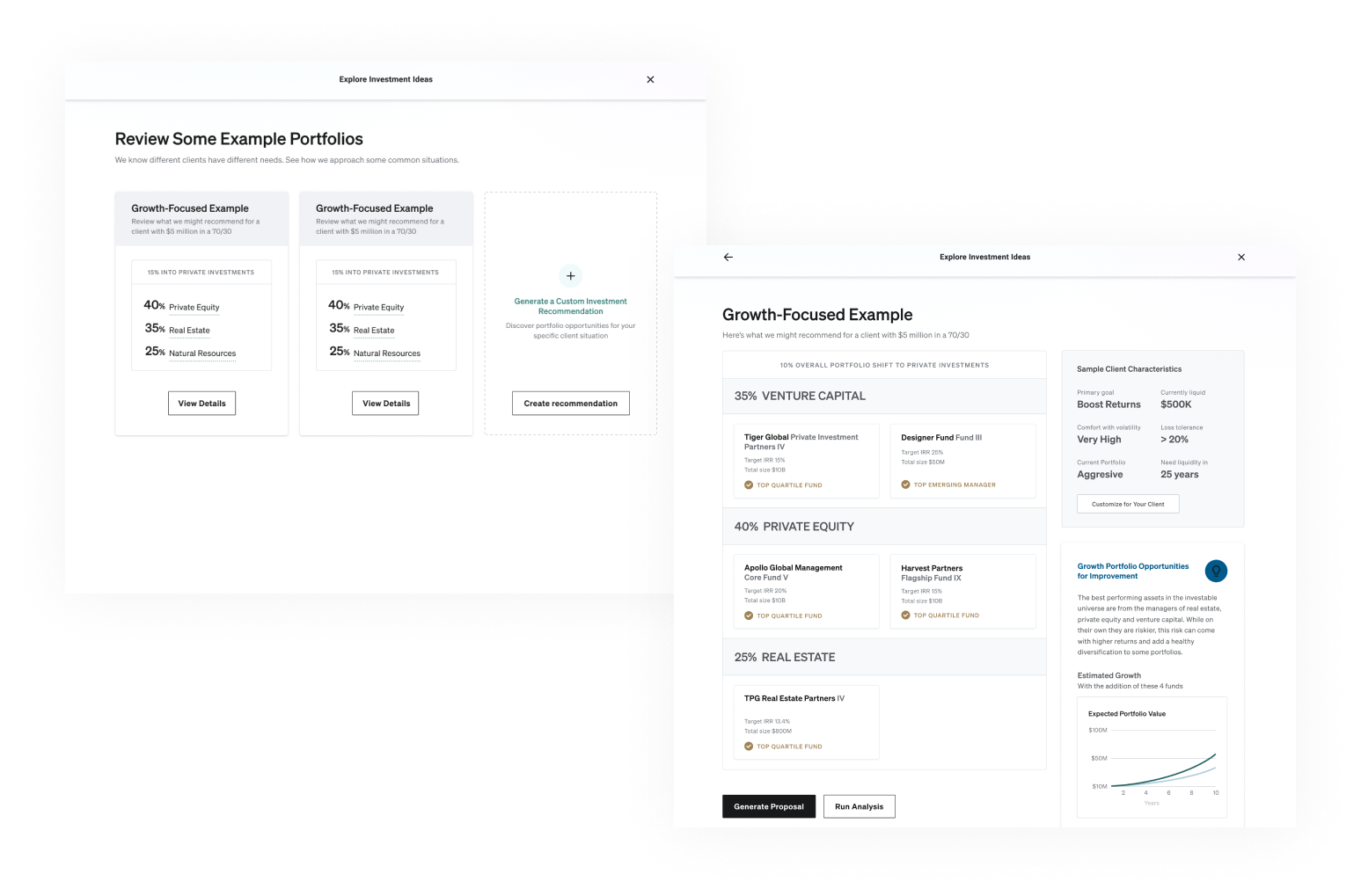
I quickly wireframed several page structure options for that first screen.
I had around 10 wireframes, but these were the best examples of the two main directions I explored: Horizontal vs. Vertical cards.
Ultimately we decided the vertical cards worked better, as the page felt like a familiar product comparison chart.
I handed off to the other product designer to apply the existing design system to the wireframes.
I realized we didn't need a not-included icon next to the fund types, and had it removed. This made it easy to scan the checked investment types across all three portfolios, making it easier to intuit which fund types were used for which purposes.
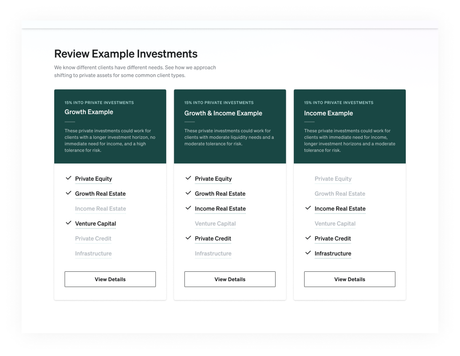
Early users were loving the approach, and even asking questions that pointed to a need for a 4th example around Diversification.
We tried adding to the above design, but it started to look very cluttered with so much repeated text in so little space.
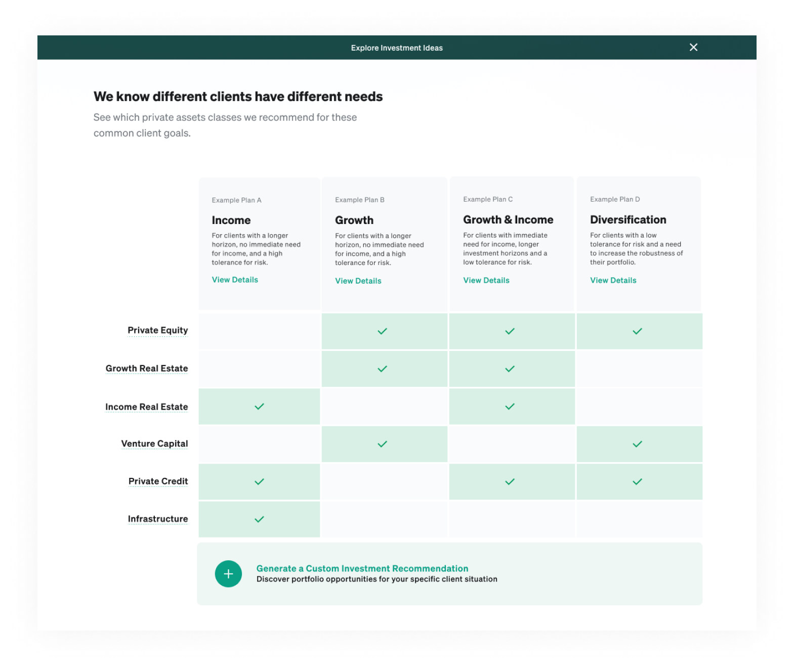
So, we pivoted to a table approach, and refined the colors and styling with brand direction updates happening in parallel.
Results
The separate screen worked exactly as intended.
Advisors could easily understand the context, and instantly began learning new things in an intuitive way, drawn in to ask questions, fully absorbed by the time they hit the next step.
Read about the rest of this project and broader results in this case study:
Leading Product 0->1 on a Private Investment Platform for
Advisors