
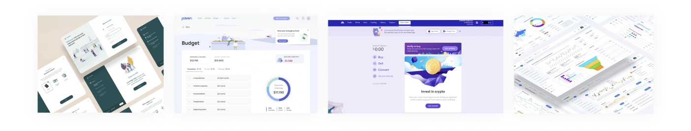
Leading Product 0->1 on a Private Investment Platform for Advisors
The vision was to have a full platform that made it easy to learn about, invest in, and manage private fund investments. A Beta was needed in 3 months.
The company's competitive strategy was to be the “best UX in the market”
We needed an achievable scope for a Beta that would inspire customers to believe.
The only clear expectation was that a Beta would recommend an intelligent mix of private funds to invest in, that considered client goals and holdings (to be provided by the user).
I set out to uncover what exactly Advisors really needed (first) from our platform, and how we needed to approach the experience.
I watched videos of early concept research, interviewed our internal experts, and conducted generative research sessions myself.
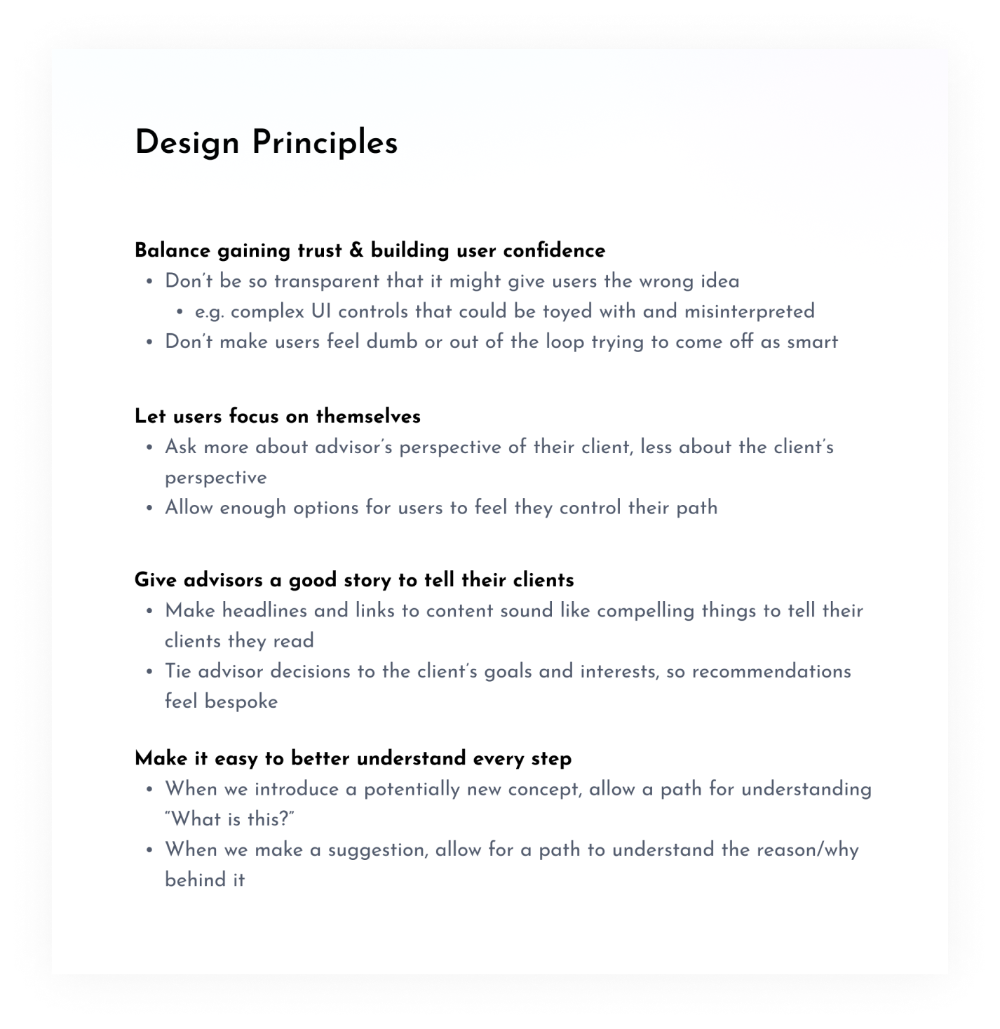
Through the process, I quickly outlined some lightweight Design Principles to guide my work going forward.
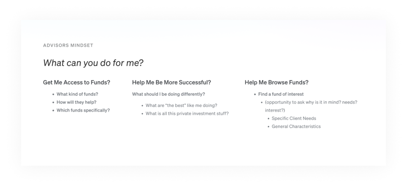
I documented user motivations from user interviews and consultations with internal experts.
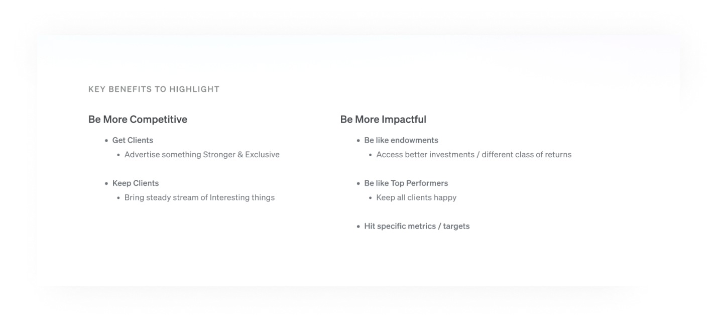
I worked with the co-founders to hone in on the key benefits for advisor users.
I envisioned several potential systems to both teach and generate a recommendation. I constructed flows to help us converge on a direction.
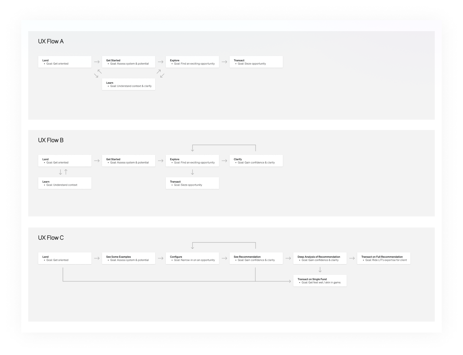
I created 3 high-level flows for the options.
Did we want to facilitate transactions as users were still learning? Did we want to separate the “learning” from the conversion flow?
We converged on a flexible approach of allowing the user to pivot in and out of “learning” throughout the conversion flow.
Next, we started designing screens.
I picked up an existing concept wireframe.
I split it into two sequential screens.
More details available in this case study: Enticing Advisors Into Conversion with a Flexible System of Intuitive UI
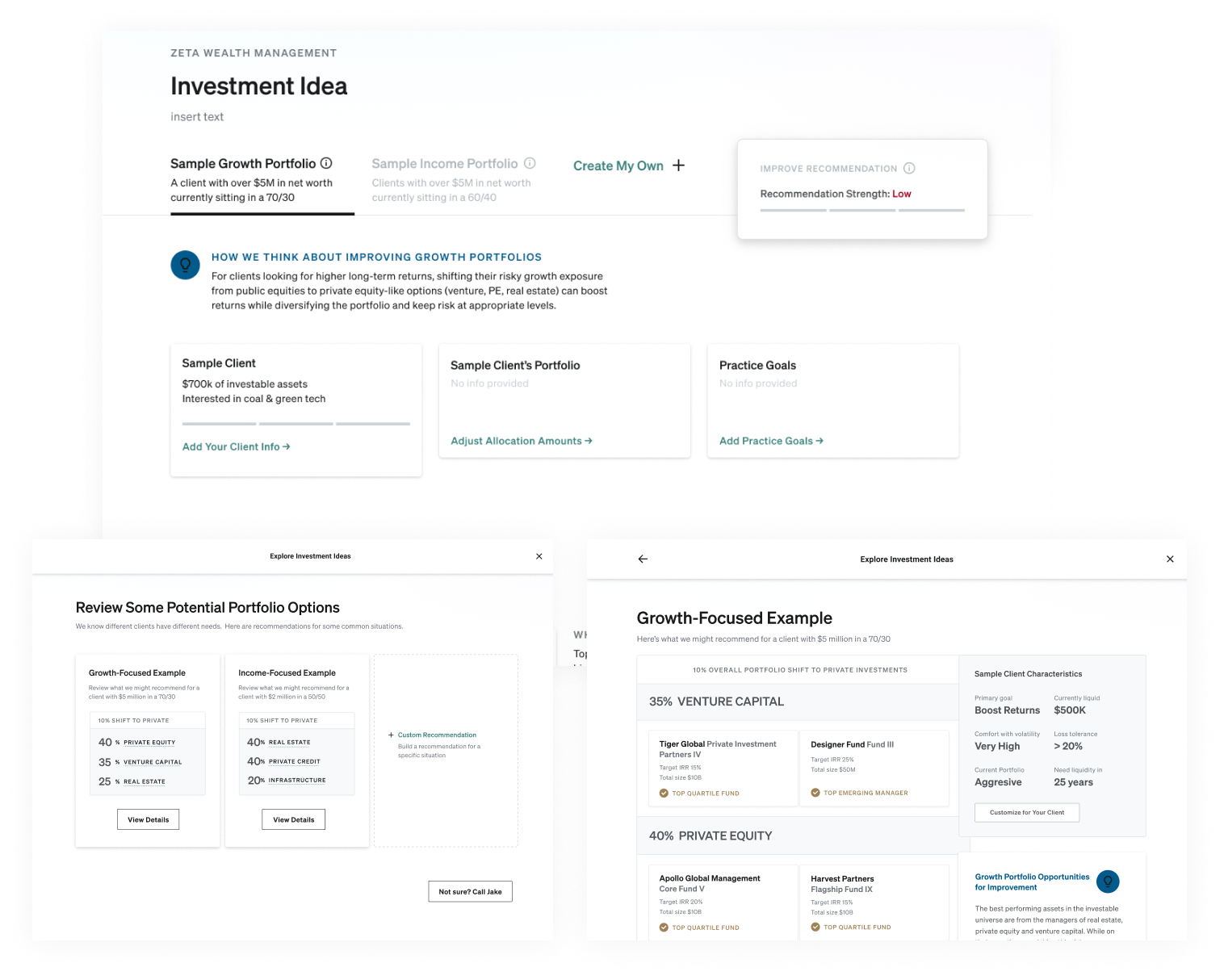
Once users understood the Example portfolios and were enticed to try variations, we created a simple customization form.
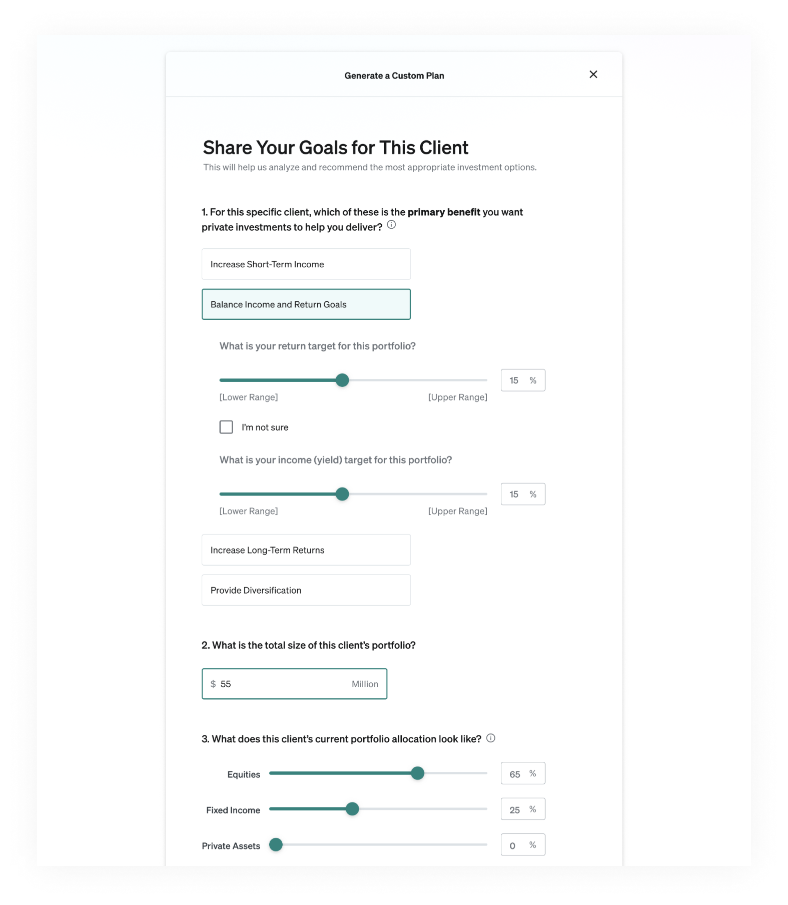
It started as just a few questions, but continued to grow in complexity and scope as we reviewed with internal experts, and incorporated the complex realities of investment strategy.
Our leaders and stakeholders were experts in this space, so continuously navigated >keeping the balance between simplicity and being intellectually rigorous.
I created a map of all the necessary screens for Beta and built a prototype.
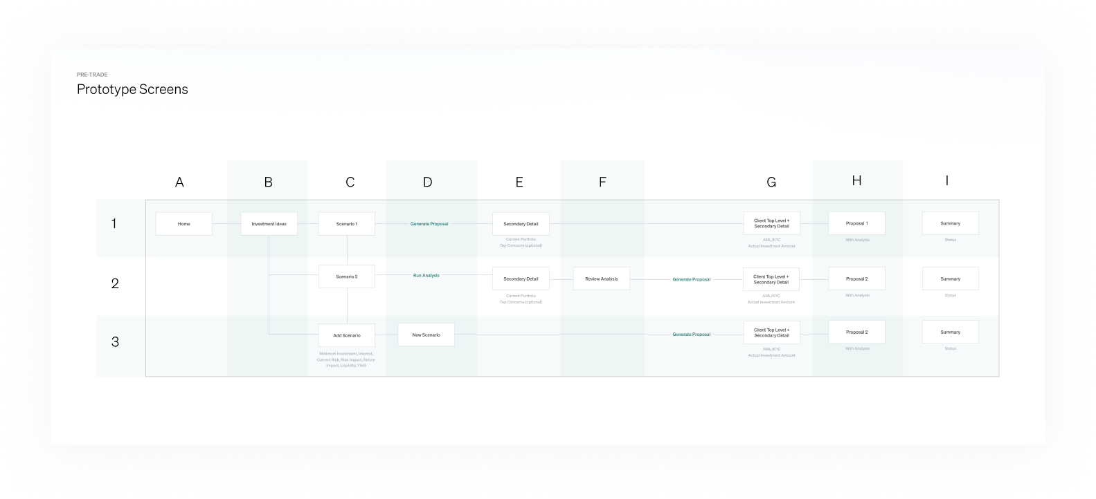
Leaders and engineers were able to understand the target experience as development started, and we were able to use the prototype to test with users.
We continued to iterate on the UI Designs
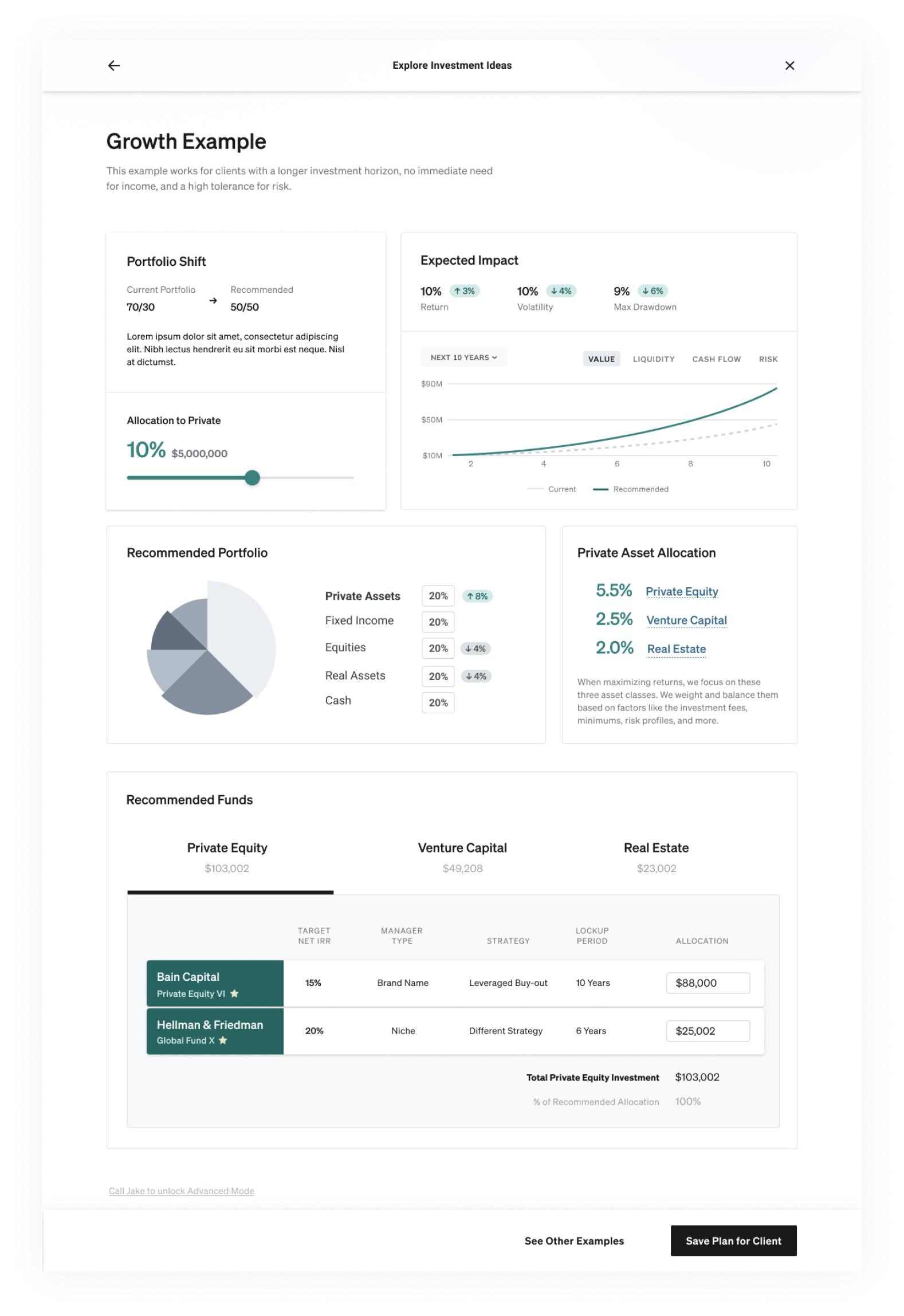
Advisors really enjoyed seeing charts change when adjusting a simple slider.
I introduced a similar slider in this new context.
We stripped away elements until the UI felt simple and clear.
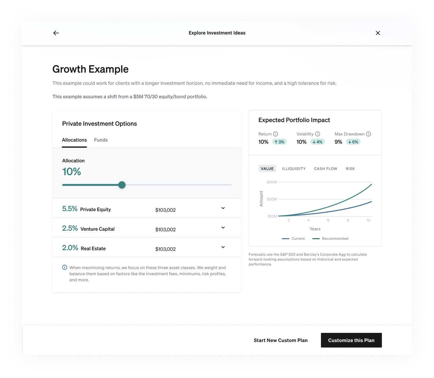
We moved detailed context one-click away, in drawers, tooltips, and pop-up links, refining details as we regularly reviewed with users and advisors.
We landed on this simple, clean view, that users were instantly able to interpret and gain insights from.
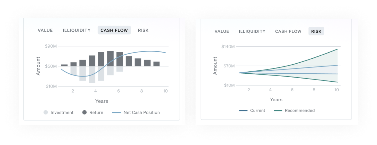
We worked hard to identify charts that would help users understand the impact of these investments.
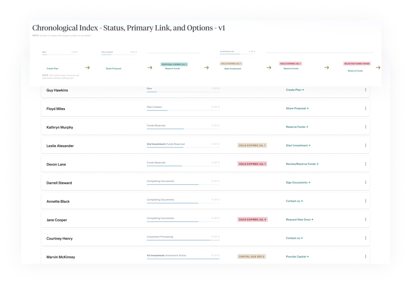
With 100% of users eager to explore multiple custom plans, we needed to create a home for them, as a way to get back to them.
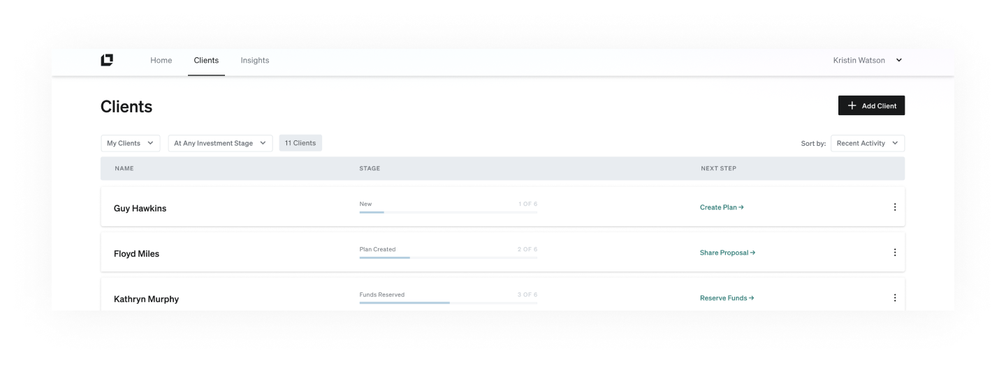
We created a simple client list, with dynamic status and link to the recommended next step for each.
At this point, we were ahead of schedule with advisors already asking about when they could complete the transactions.
We started to think about the full system for handling the investment flow as well.
I developed UI logic and created visual assets for internal collaboration and documentation.
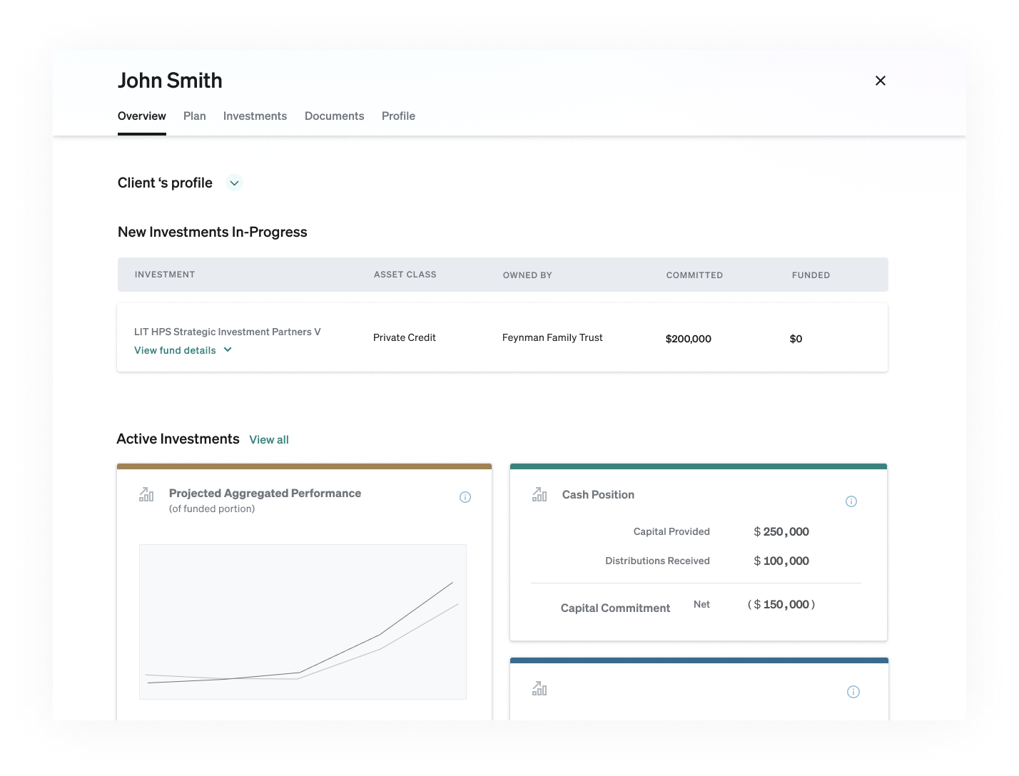
We also started roughing-out how a client detail page would work, where the plans and active investments would be shown in more detail.
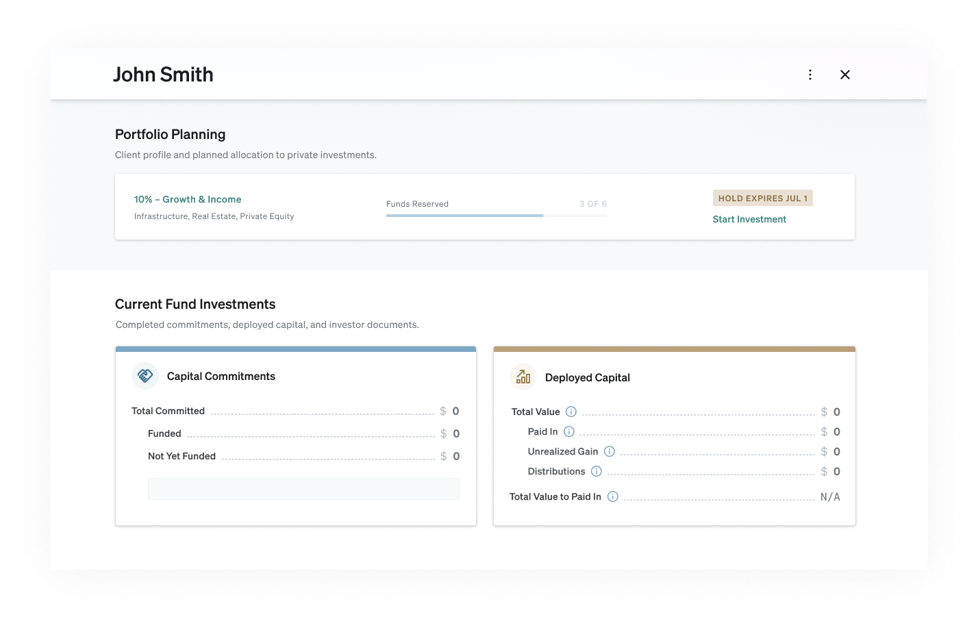
It evolved to yet another clean, but highly dynamic page, capable of handling hundreds of cases, while keeping the empty and early states feeling simple and clear.
We all felt great about Beta plan, and I had a strong vision for what would come next.
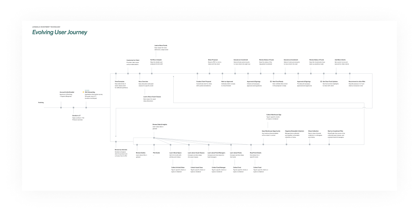
I mapped out a full system flow to show the vision for the target state in the next 6 months
I even created a mood-board for how our style could evolve.
Results
We found that even with the quick work, the pieces we built impressed and inspired our early prospects.This Beta successfully:
• Led to the first-ever transactions for the company
• Engaged interested customers by the dozens
• Increased Series-A investments
• Initiated powerful partnerships
• Aligned the org on key next steps and a clear product roadmap
No small feat. :)