
Setting Strategic Approach to Fix Data Connections and Accounting in QuickBooks
Pulling data into QuickBooks and reconciling it into proper accounting was not working for our customers. I was tapped to overhaul it.
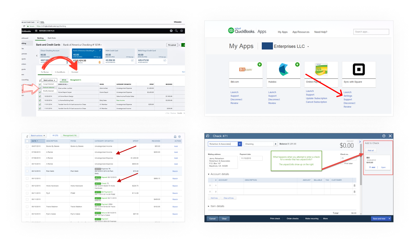
Users were frustrated by the differing approaches to the same actions and surprised by many errors in their top-level business numbers.
Accountants were reporting that the data in QuickBooks often required tedious clean up of duplicates and unreconciled transactions.
Our system was not quite as smart or simple as it appeared to users, and we urgently needed to put up guardrails.
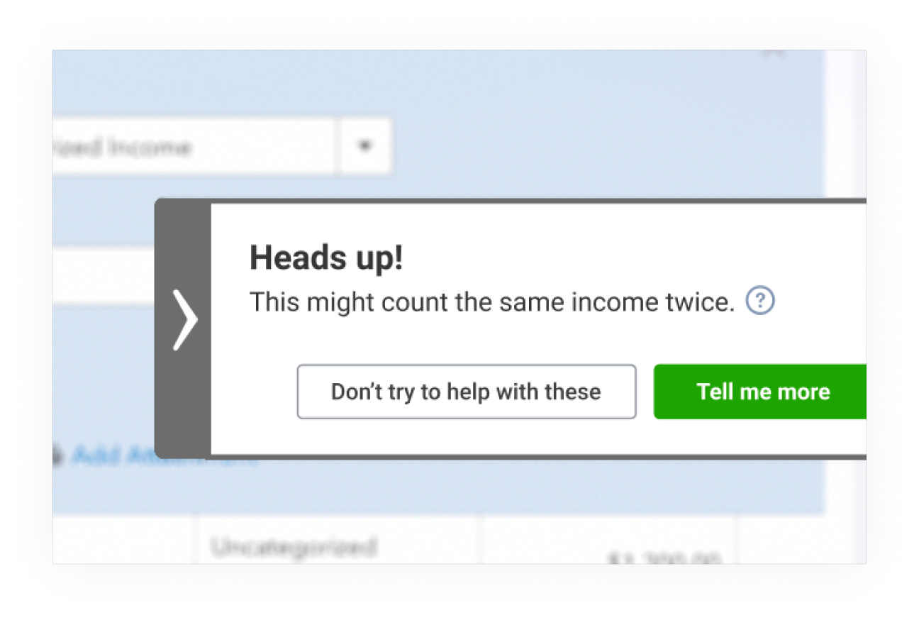
It was well known that the majority of users had duplicate entries, due to the many different ways data was coming in.
To prevent this problem from growing, we inserted a friendly alert to the Banking feed, to slow users when they were likely about to duplicate a record.
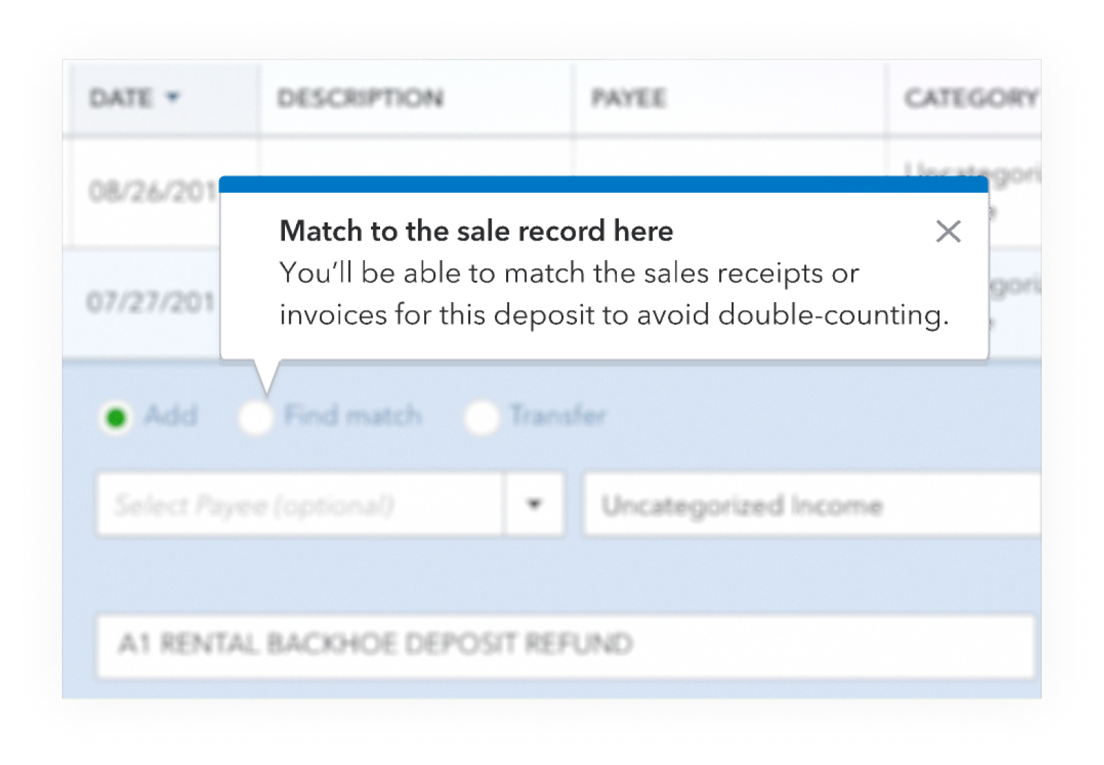
For users that engaged, we followed-up with guidance pop-ups to show them how to proceed.
We didn’t like using the word “match,” as it was clearly confusing users. We were later able to replace it throughout the product, but in the meantime, we tried to explain and expound upon it.
There were many internal experts with strong opinions about how all of this should actually work. I led a series of workshops to capture and align on design principles.
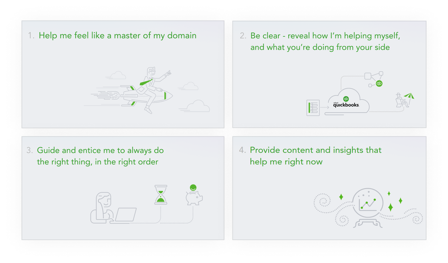
I worked closely with my Content Designer to process hundreds of inputs, and created a series of design principles to guide the UI and content design for the this area of the product.
I also created a nice deck and presented them widely to leaders and stakeholders (illustrations were pulled from a repository of brand assets).
This process inspired strong ideas for improvement. I created a concept illustration to visualize the potential ideal experience.
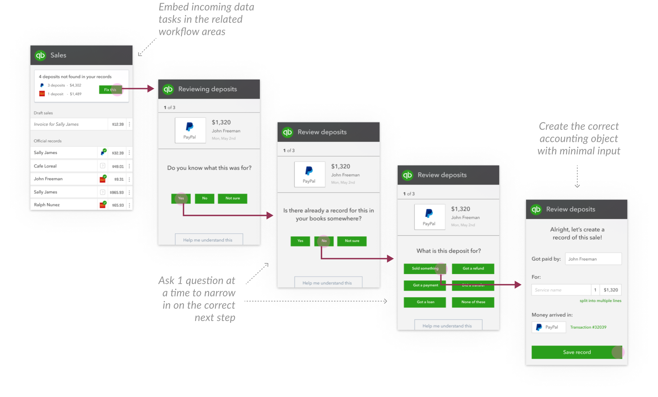
I proposed that incoming data should appear in-context in the corresponding areas of the product (liberating it from a siloed data-review area).
I also proposed a system where users would be walked through a series of simple questions and we could point them to the correct next step.
Users loved this simple direction in reviews, and there were no concerns from stakeholders about the UX, but it was going to be a huge undertaking, and in the meantime...
Many users already had accounts full of duplicate and unreconciled transactions. So while we planned large fixes, we needed tools specifically to help clean things up.
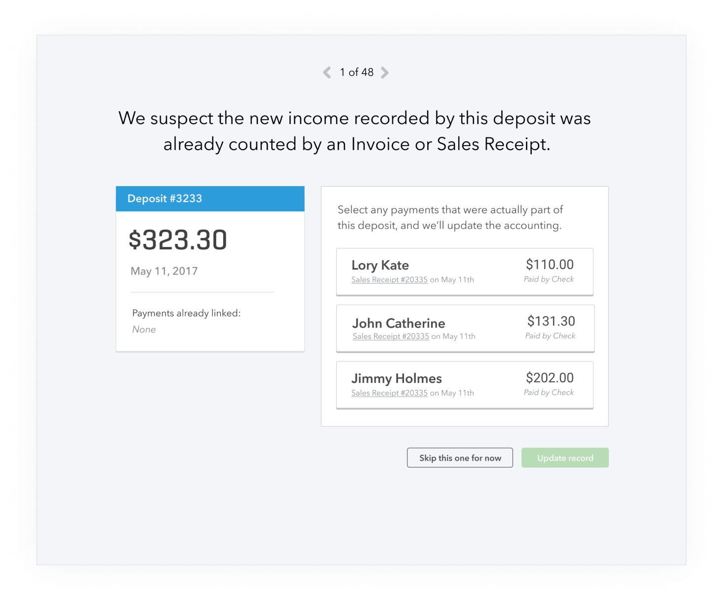
We invented a tool to solve for that last-minute tax-time crunch, that would take users through all of the incomplete and likely duplicate records in their books.
We called it SmartCheck.
Through many explorations and iterations on content and UI, we landed on this simple, focused experience of going through one transaction at a time.
The next step was to provide more targeted tools that could be incorporated into users’ weekly workflow.
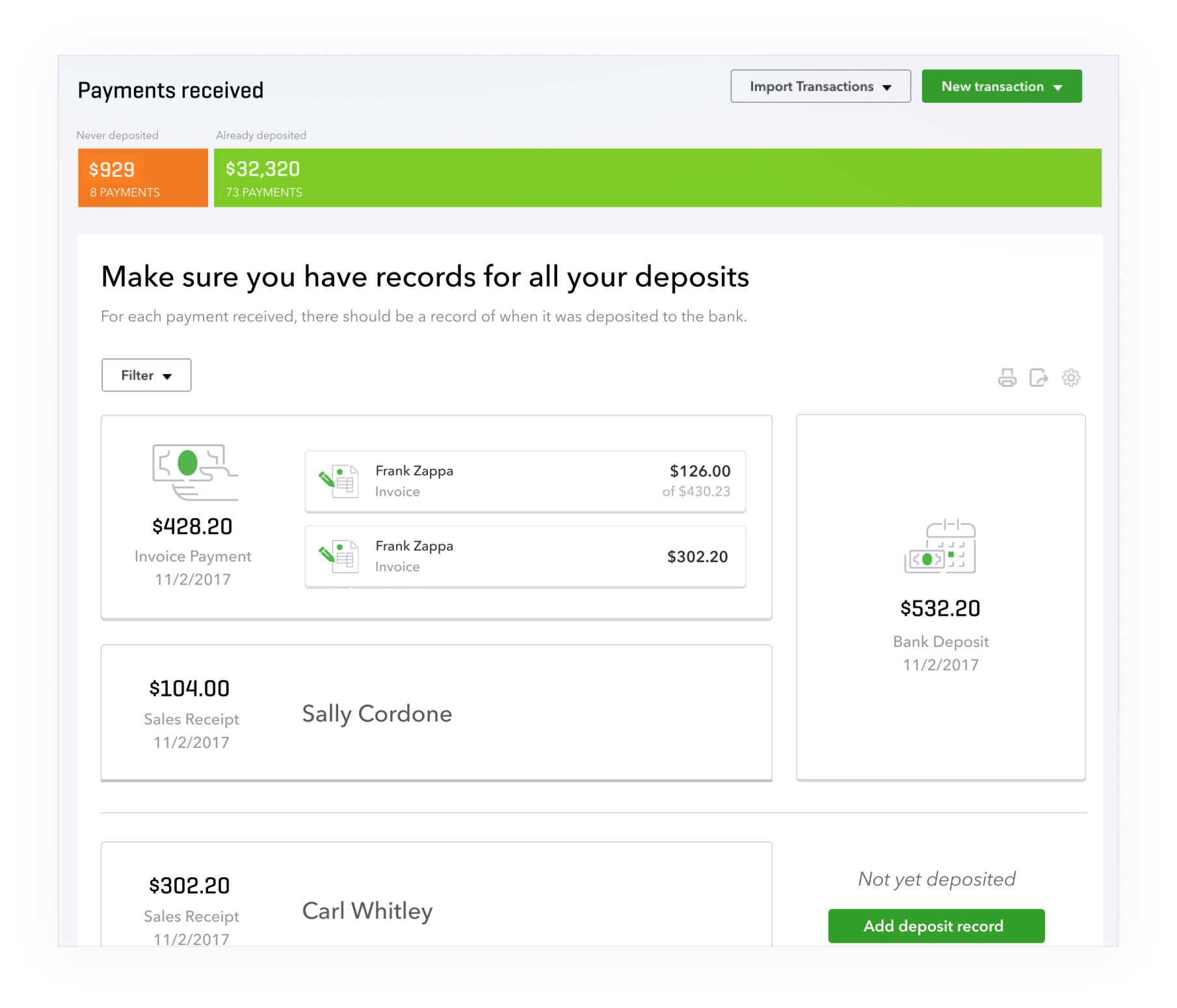
To map to the existing mental models, we created one tool for reviewing and reconciling money-in transactions and another one for money-out.
For the first time, users had a chance to visually intuit the relationship between transaction types in the product, and see how and why they needed to be reconciled.
Results
Short term, these changes were celebrated by users, and reduced new errors by an estimated 20%.
Longer term, our framework continued to bring clarity and consistency to many accounting projects for years to come.